
TWIN: Product Design and Design System from Scratch
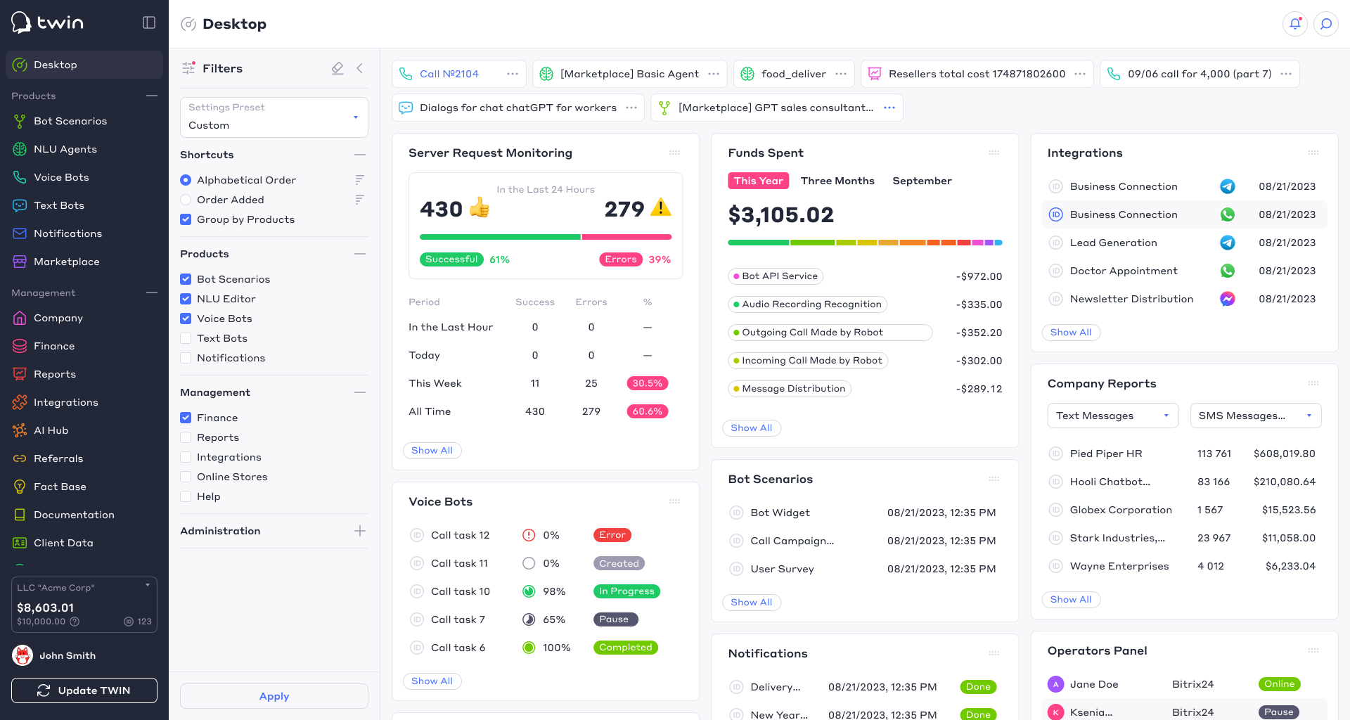
In 2018, I joined the TWIN team to help the company move from a legacy interface to a modern product design foundation.
At that time, the product already had working functionality, but the interface was built on top of an outdated front-end and legacy constructor components. The system was difficult to scale, the visual language was inconsistent, and new product directions required a unified design approach.
My goal was not just to “redesign the interface,” but to build a scalable design foundation for the platform: the user account, operator panel, bot script editor, chat widget, voice bot calling tasks, marketplace, and other product modules.
💻 My Role
I was responsible for building the product design foundation almost from scratch: from the visual language and component system to prototypes, product libraries, and team documentation.
Main areas of responsibility:
- Creating a unified visual language for the user account
- Building a system of components and styles
- Prototyping key platform sections
- Preparing a design system for product scaling
- Creating a design token system for designers and developers
- Documenting principles so the team could develop the product faster
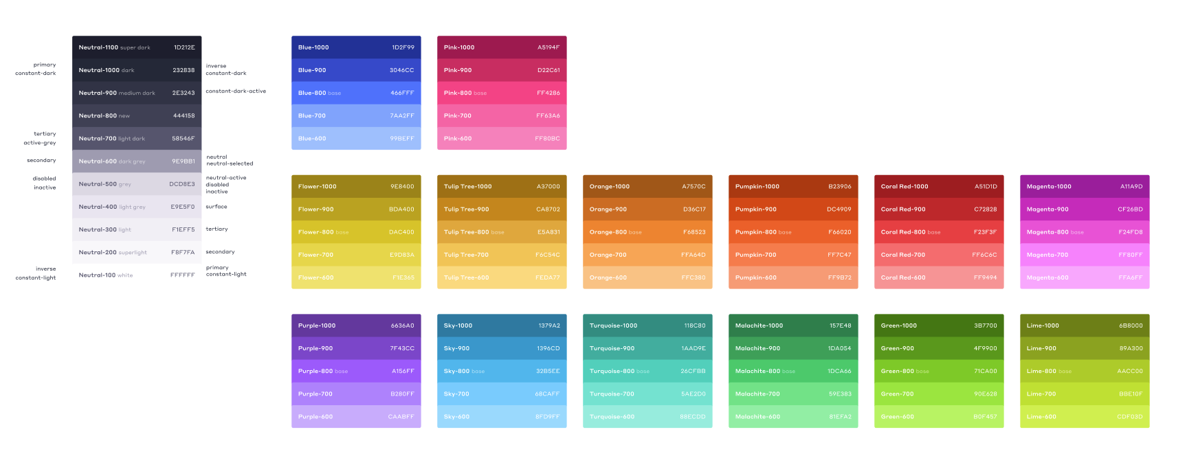
🎨 Visual System
I created a color system that helped the product remain visually consistent while supporting different interface states and product contexts.
The palette was divided into several functional groups:
- Contrast colors for key interface elements
- Accent colors for important actions
- Informational colors for statuses, notifications, and system messages
The color system was designed to work not only in the main user account, but also across other product areas as the platform expanded.
🧬 Component System
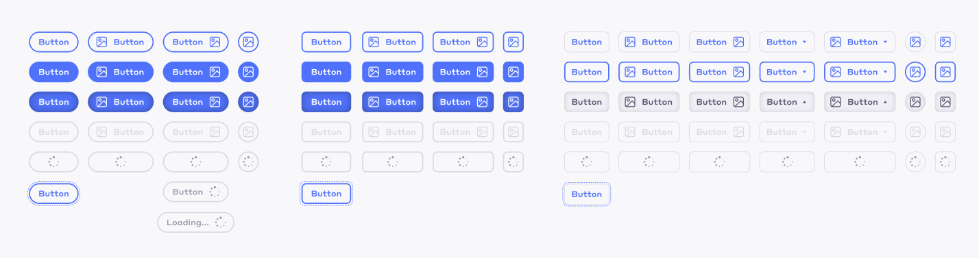
The interface was based on the atomic design approach: simple elements were combined into more complex components and product patterns.
The main goal was to help the team solve as many interface tasks as possible with a reusable set of components. This accelerated development, preserved visual consistency, and reduced repetitive work in design files.
Components were designed not as isolated UI elements, but as parts of a larger system that could be reused across different sections of the platform.
🛠️ Design System Architecture
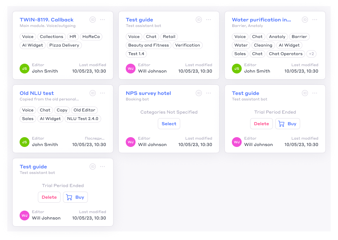
I structured the libraries using a “core and product layers” model.
The core contained the shared design system: styles, components, tokens, and common rules. Product-specific libraries were built on top of it for separate platform areas: the user account, operator panel, bot script editor, chat widget, and other modules.
This approach allowed the product to scale without losing consistency. Changes in the core system could be propagated across connected design files, reducing the need to manually update the same components across dozens of screens.
🧩 Design Tokens
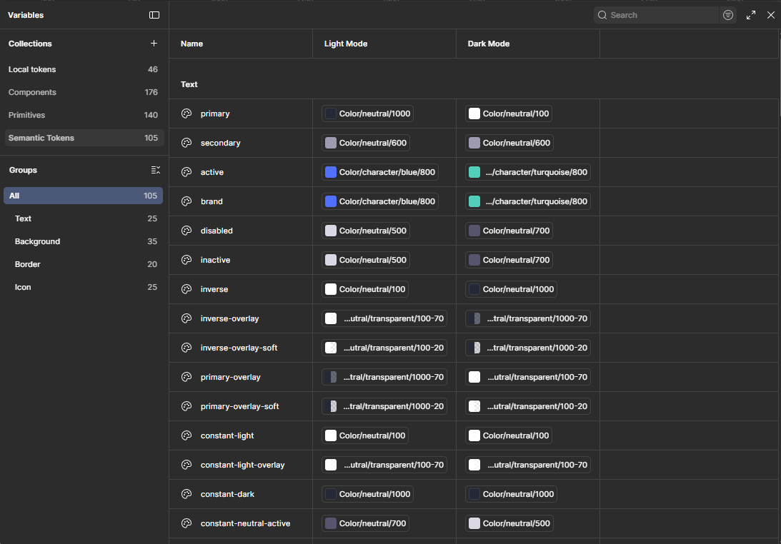
I developed a design token system that described colors, typography, and other interface properties through clear semantic variables and styles.
This made the design language easier to understand for both designers and developers. The team could understand the purpose of an interface property from its semantic name instead of constantly checking documentation or individual screens.
Tokenization also simplified interface maintenance and created a foundation for future improvements such as theme switching, dark mode, and interface customization for white-label clients.
📊 Result
As a result, TWIN received a scalable product design foundation: a visual system, component libraries, design tokens, and team documentation.
The system helped the team launch new product sections faster, maintain a consistent visual language, and reduce the need for constant designer involvement in routine interface decisions.
New designers and developers received clear rules for working with the interface, while the team was able to scale the user account and related product areas faster and more predictably.
The product analytics snapshot shown below recorded 14.1k MAU, 5.03k WAU, and 1.48k DAU for the TWIN user account, demonstrating that the system was supporting a mature product used by thousands of active users.
