
TWIN: Dark Contrast Theme

After connecting the component library to the system of variables and design tokens, I was able to create a dark contrast theme for the TWIN interface and related product modules.
The idea came not only from marketing needs, but also from user feedback. Some users complained that the interface was too bright for working in the evening or at night. Several of them used browser plugins to force dark backgrounds, which created unpredictable visual results and could break the intended interface appearance.
I saw this as a product design opportunity: instead of letting users rely on external tools, we could provide a controlled, consistent, and comfortable dark theme inside the product.
🚩 Problem
By that time, the platform had already grown significantly. The number of screens, modules, and interface states made it impossible to redesign everything manually.
A manual approach would have been too slow, inconsistent, and difficult to maintain. Any future changes would require constant updates across many screens and product areas, which would create unnecessary design and development overhead.
The challenge was to create a dark theme that could scale across the platform through the existing design system.
✅️ Solution
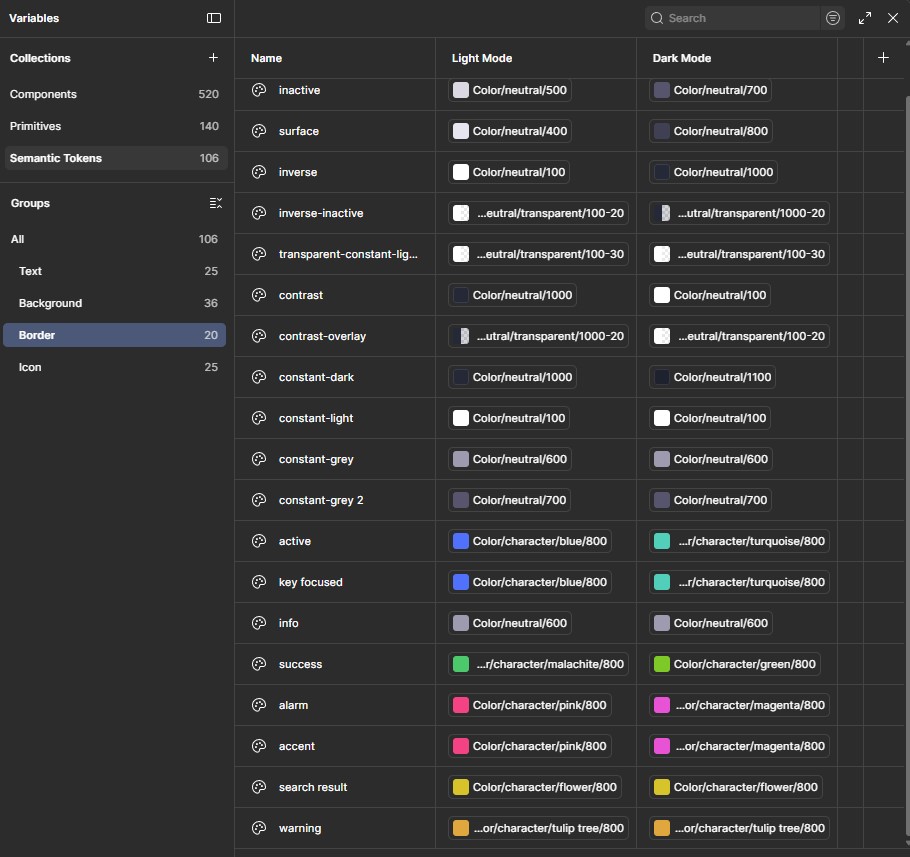
I created an alternative set of design variables for the dark theme.
Because the interface was already connected to tokens and component styles, the dark theme could be applied automatically to screens covered by the design system. This made it possible to update large parts of the product without manually recoloring every component or screen.
I adjusted the existing color palette for dark mode while keeping the visual identity of the product. Accent colors became brighter and more contrastive, while background colors were rebuilt for a darker interface environment.
The main goal was not only to make the product look more visually attractive, but also to improve eye comfort and readability in low-light conditions.
🎨 Visual Approach

The dark theme was based on the existing TWIN color system, but with a shifted emphasis.
I reworked:
- Background colors
- Surface colors
- Text contrast
- Accent colors
- Informational states
- Component states
- Interface hierarchy
The goal was to keep the interface familiar while making it more comfortable for long work sessions and darker environments.
🔎 Testing
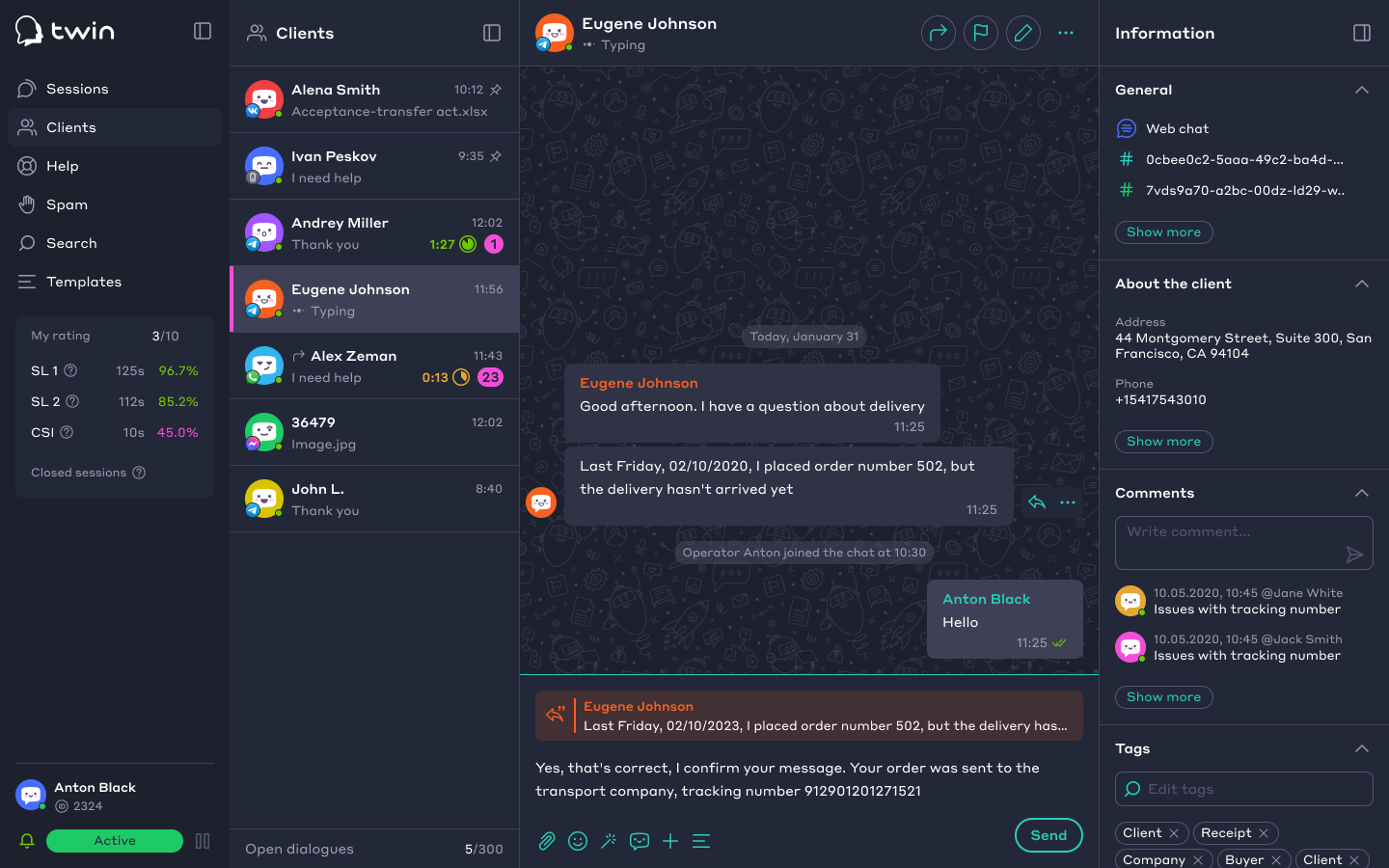
I first tested the theme myself during evening and night work sessions with low ambient light.
After that, I involved colleagues as a small focus group to collect broader feedback on readability, contrast, and overall perception.
This helped refine the palette and avoid solutions that looked good in static mockups but felt uncomfortable during real use.

📊 Result
As a result, I created a universal dark contrast palette that covered all TWIN product areas supported by the design system.
The token-based approach made the theme scalable and ready for integration into live product modules. Instead of creating a separate visual layer manually, the dark theme became part of the product’s design infrastructure.
This improved visual comfort for users, supported work in low-light environments, and created a more attractive alternative appearance for the platform.